Describing Trends
Describing Trends Lesson
写作技巧
Pie Chart & Table Introduction 同义改写训练** The pie charts below show the percentage of time working adults spent on different activities in a p
Introduction 同义改写训练
The pie charts below show the percentage of time working adults spent on different activities in a particular country in 1958 and 2008.
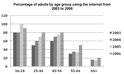
The chart below shows the percentage of adults of different age groups in the UK who used the Internet every day from 2003-2006.
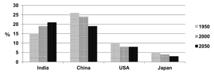
The chart below shows the percentage of the whole world population in four countries from 1950 to 2000, with projections till 2050.
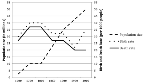
The line graph below shows the population size, birth rate and the death rate of England and Wales from 1700 to 2000.
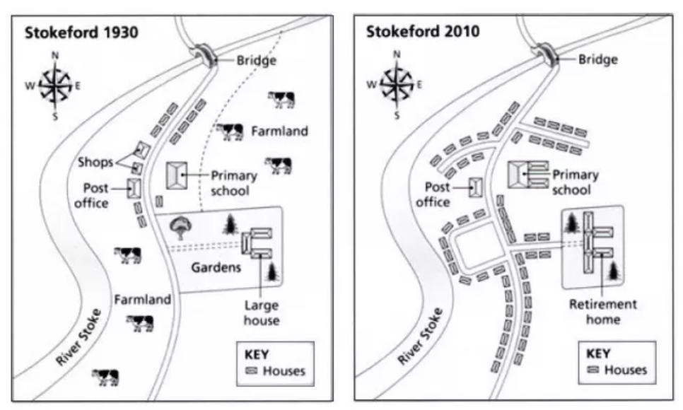
The diagrams below show the changes that have taken place in the village of Stokeford in 1930 and 2010.
重点:比较级/最高级结构,提及所有的种类,丰富的词汇和语法结构
时间分配:找关键特征/构思 2 min;介绍 2 min;概述 3 min;主体段 6 min;检查 1 min
练习 1
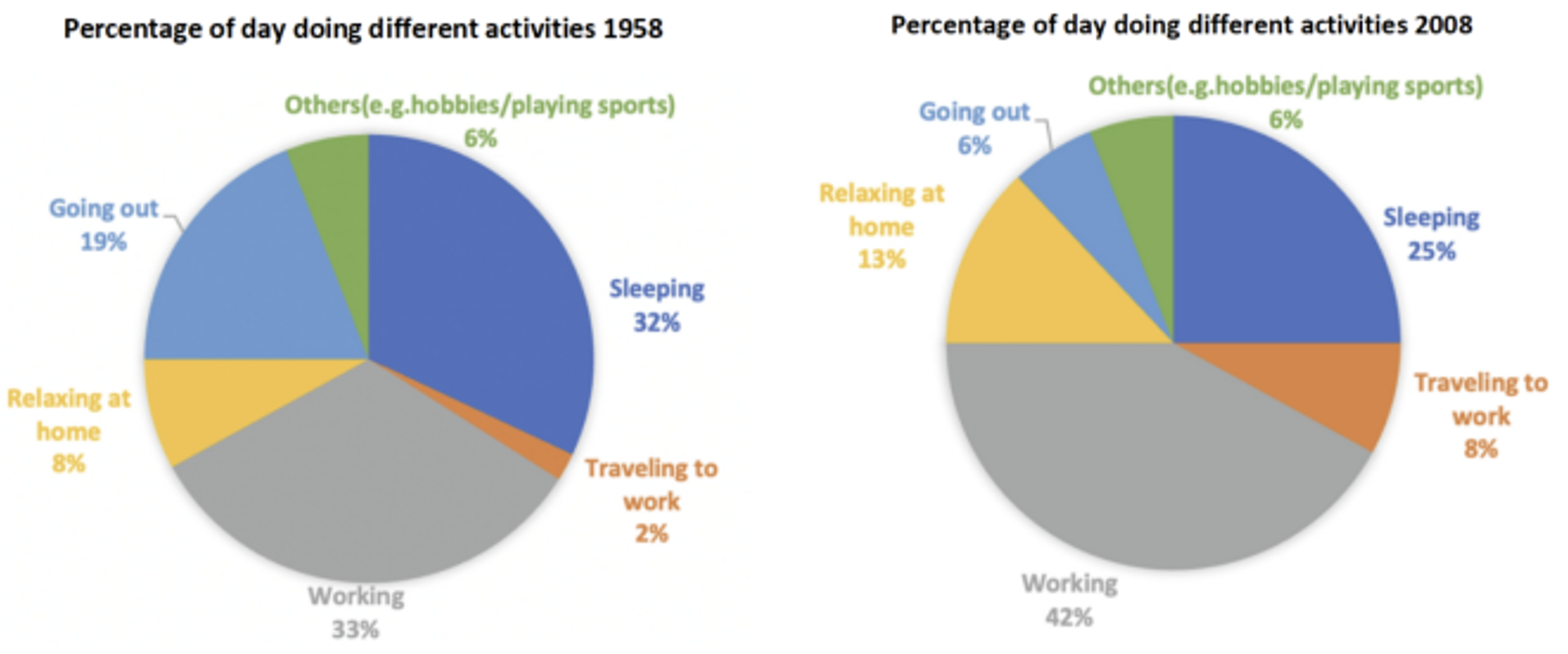
The pie charts below show the percentage of time working adults spent on different activities in a particular country in 1958 and 2008.
Summarise the information by selecting and reporting the main features, and make comparisons where relevant.
Sample
The two pie charts illustrate the percentage of time working adults in a particular country spent on six activities in 1958 and 2008.
Overall, the most noticeable trends are an increase in the proportion of time spent on working and traveling to work, and a decrease in the percentage of time allocated to sleeping and going out. Other activities, such as relaxing at home and engaging in hobbies or sports, experienced smaller changes over the 50-year period.
In 1958, the largest portion of adults’ time was spent on working (33%), followed closely by sleeping, which accounted for 32% of the day. Going out, such as socializing with friends or family, made up 19% of the day, while only 8% was spent on relaxing at home. Activities like traveling to work and engaging in hobbies or sports occupied the smallest shares of time, at 2% and 6%, respectively.
By 2008, working had become the dominant activity, with 42% of the day dedicated to it, an increase of 9%. In contrast, sleeping saw a substantial decline, dropping to 25% of the day. Time spent on going out plummeted significantly from 19% to just 6%, while the percentage of time spent on relaxing at home increased noticeably to 13%. Similarly, traveling to work saw a fourfold rise, climbing from 2% in 1958 to 8% in 2008. The time spent on hobbies and sports, however, remained constant at 6%.
重点:从数字中看出趋势,选择关键信息进行描述和比较/对比,词汇/语法结构(不用提及所有的数字,选有特点的)
纯静态图
练习 2
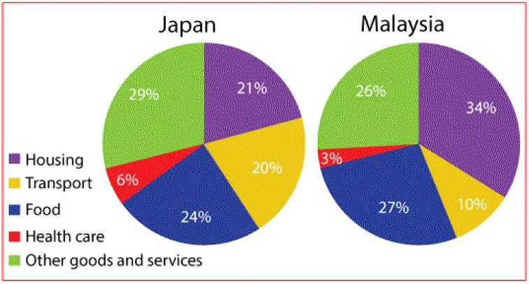
The pie charts below show the average household expenditures in Japan and Malaysia in the year 2010.
Summarize the information by selecting and reporting the main features, and make comparisons where relevant.
Sample
The pie charts compare the average household spending in Japan and Malaysia in terms of five important categories in 2010.
Overall, it is clear that Japanese and Malaysian people spent the largest proportion of their budget on just three categories, namely housing, food and other goods and services. Moreover, the expenditures on healthcare and transport in Japan were double the figures for Malaysia.
In Malaysian households, the greatest proportion of spending was on housing, which represented 34% of the total expenditure, while in Japan, the figure for this category was just 21%. Japanese householders spent the largest amount of their income on other goods and services, at 29%. Meanwhile, the rate of spending on this category in Malaysia was slightly lower, at 26%.
In terms of food, the percentages of expenses for both nations were relatively similar, at 27% for Malaysia and 24% for Japan. In both countries, the smallest proportion of spending was on health care. In Malaysia, this accounted for 3% of the total household expenses, while the figure for transport represented 10%. These figures were exactly doubled in Japan which were 6% and 20% respectively. (188 words.)
练习 3
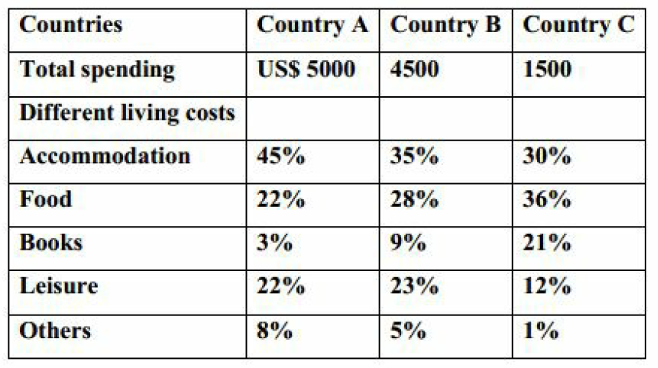
The table below gives information about the average annual spending of university students in three different countries.
Sample
The given table compares the percentage of expenditure which college students from 3 countries spend on different living expenses each year.
Overall, the total spending of students in country A is higher than the expenditure of students in countries B and C. In all the countries, students spend the highest proportion of their budget on accommodation and food.
In country A, the total spending of students is the highest, at 5000$ per year, compared with $4500 and $1500 for students in countries B and C respectively. Accommodation accounts for 45% of the total expenditure of students in country A, while the proportions were lower for students in country B at 35%, and country C, at only 30%.
However, in terms of food, students in country C spend the largest percentage of their money on it, accounting for 36%. The figures for country A and B are only 22% and 28% respectively. Students in country C also spend a high percentage of their budget on books, at 21%, compared with 9% for students in country B and just 3% for students in country A. By contrast, students in countries A and B spent 22% and 23% respectively of their budget on leisure, while students in country C spent only 12% of their total money on this category. (196 words.)
练习 4
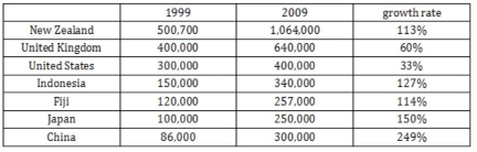
The table shows information about the numbers of Australian people who visited the seven most popular destinations in 1999 and 2009.
Sample
The table provides data on the number of Australian travelers who visited seven popular international destinations in 1999 and 2009, along with the percentage growth rates for each destination over this period.
Overall, all destinations saw an increase in the number of Australian visitors, with China experiencing the most significant growth, while the United States had the lowest. New Zealand remained the most visited destination in both years, and Indonesia saw the highest growth rate among Southeast Asian countries.
In 1999, New Zealand was the top destination, attracting 500,700 Australians, which more than doubled to 1,064,000 in 2009, marking a growth rate of 113%. The United Kingdom was the second most popular destination, with 400,000 visitors in 1999, growing by 60% to 640,000 in 2009. The United States saw a relatively smaller increase, from 300,000 to 400,000 visitors, reflecting a modest 33% growth.
Among Asian countries, Indonesia and China experienced remarkable growth. Visitors to Indonesia surged from 150,000 in 1999 to 340,000 in 2009, (representing) an increase of 127%. China saw an even more dramatic rise, with the number of Australian visitors tripling from 86,000 to 300,000, representing a growth rate of 249%, the highest among all destinations. Fiji and Japan also witnessed substantial increases. Fiji doubled its visitors from 120,000 to 257,000, while Japan experienced a 150% rise, with the number of travelers growing from 100,000 to 250,000.
重点:可能出现不同的组合,注意不同图的特征;Introduction 和 Overview 所有图都要提及;分别介绍不同图的细节,不用比较/对比不同的图,但是要在各自的图里比较/对比特征数字。
练习 5(静态双图)
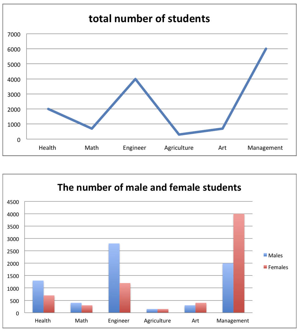
The graph and the chart below show the number of students choosing different kinds of courses in a particular university in 2012.
Sample
The two charts provide information about the number of students enrolled in six different courses at a university in 2012. The line graph illustrates the total number of students in each course, while the bar chart breaks this down into the numbers of male and female students.
Overall, management had the highest number of students, while agriculture and art courses attracted the least. Additionally, there were noticeable gender disparities in certain courses, such as engineering and health.
From the line graph, it is clear that management was the most popular course, with approximately 6,500 students. Engineering followed with around 3,000 students. Health and math both had moderate enrollments of approximately 2,000 students each, while agriculture and art were the least popular, with enrollments of fewer than 1,000 students each.
The bar chart highlights significant differences in gender distribution. In engineering, males dominated, with about 4,000 male students compared to only 1,000 females. Similarly, in management, males outnumbered females significantly, accounting for almost 4,000 students, compared to 2,500 females. Conversely, health courses were more popular among females, who comprised about 1,500 students, compared to only 500 males. In math, the gender distribution was roughly equal, with around 1,000 students of each gender. For agriculture and art, the enrollments were small, with both genders represented in nearly equal numbers.
练习 5 (动态双图)
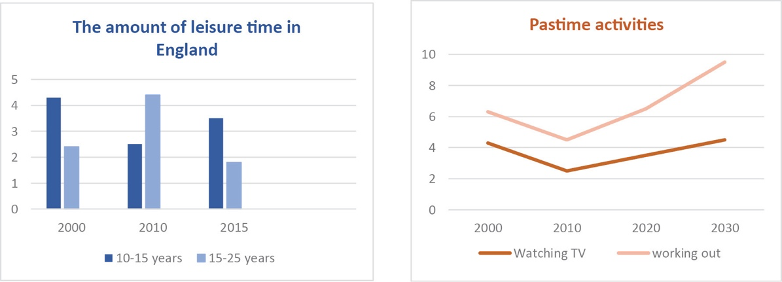
The bar chart shows the amount of leisure time (hours per day) different age groups in England had, and the line graph shows several types of pastime activities (hours per week) with a projection for the future.
Summarize the information by reporting the main features and making comparisons where relevant.