

Describing Trends
Describing Trends Lesson
写作技巧
小作文范文仿写汇总 C12T5 The bar chart compares the proportion of Australian men and women in different age groups who regularly participated in phys
C12T5

The bar chart compares the proportion of Australian men and women in different age groups who regularly participated in physical activity in 2010.
Overall, women were more likely than men to participate in regular exercise across most age groups, with the only exception being the 15 to 24 age group. Additionally, the participation rates among women remained relatively consistent with age, while male participation showed greater fluctuation.
In the 15 to 24 age group, 52.8% of men engaged in regular physical activity, slightly higher than the 47.7% of women. However, this trend reversed in the older age groups. For instance, among those aged 25 to 34, the proportion of physically active women rose to 48.9%, while the rate for men declined to 42.2%. This gender gap widened further in the 35 to 44 group, where only 39.5% of men exercised regularly, compared to 52.5% of women.
The highest female participation was observed in the 45 to 54 age group at 53.3%, whereas male participation remained lower at 43.1%. A similar pattern continued in the 55 to 64 bracket, with 53% of women and 45.1% of men being physically active. In the oldest group (65 and over), participation levels between the genders were almost equal, with 47.1% of women and 46.7% of men exercising regularly—the smallest gender difference observed.
C8T1
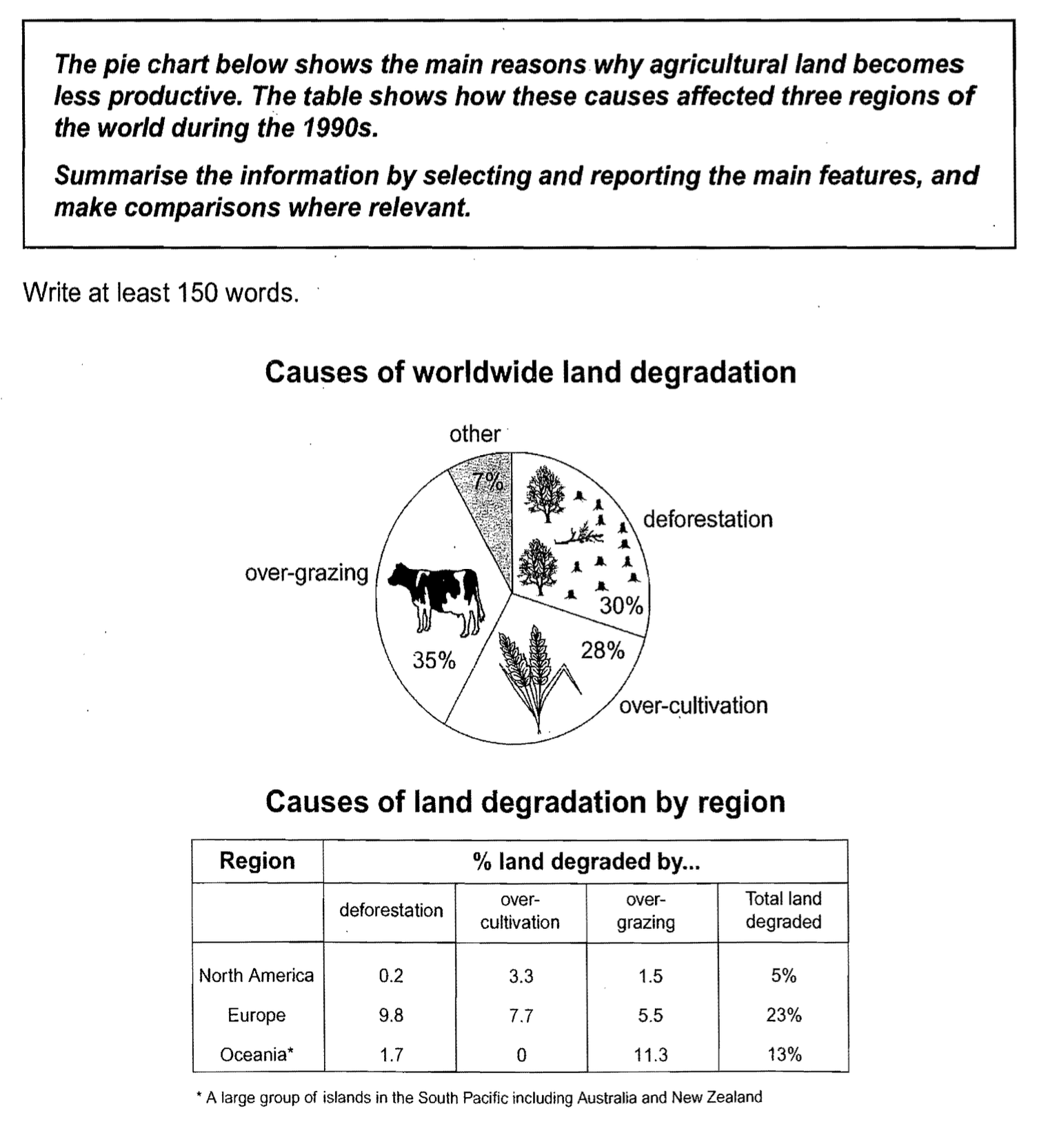
The pie chart illustrates the primary global causes of land degradation, while the table compares the extent of degraded land across three regions—North America, Europe, and Oceania—during the 1990s.
Overall, over-grazing was the leading cause of land degradation worldwide. Among the three regions, Europe experienced the highest percentage of degraded land, whereas North America was the least affected.
According to the pie chart, over-grazing accounted for 35% of global land degradation, making it the most significant factor. Deforestation followed closely at 30%, while over-cultivation contributed to 28%. The remaining 7% was due to other, unspecified causes.
The table reveals notable regional differences. Europe had the highest proportion of degraded land, with 23% of its land affected. Deforestation was the major contributor in this region, at/ accounting for/ representing 9.8%, followed by over-cultivation (7.7%) and over-grazing (5.5%). In Oceania, 13% of land was degraded, primarily due to over-grazing (11.3%), while over-cultivation was not a factor. In contrast, North America had the lowest rate of land degradation at 5%, with over-cultivation (3.3%) being the main cause, and minimal impact from deforestation (0.2%) and over-grazing (1.5%).
真题
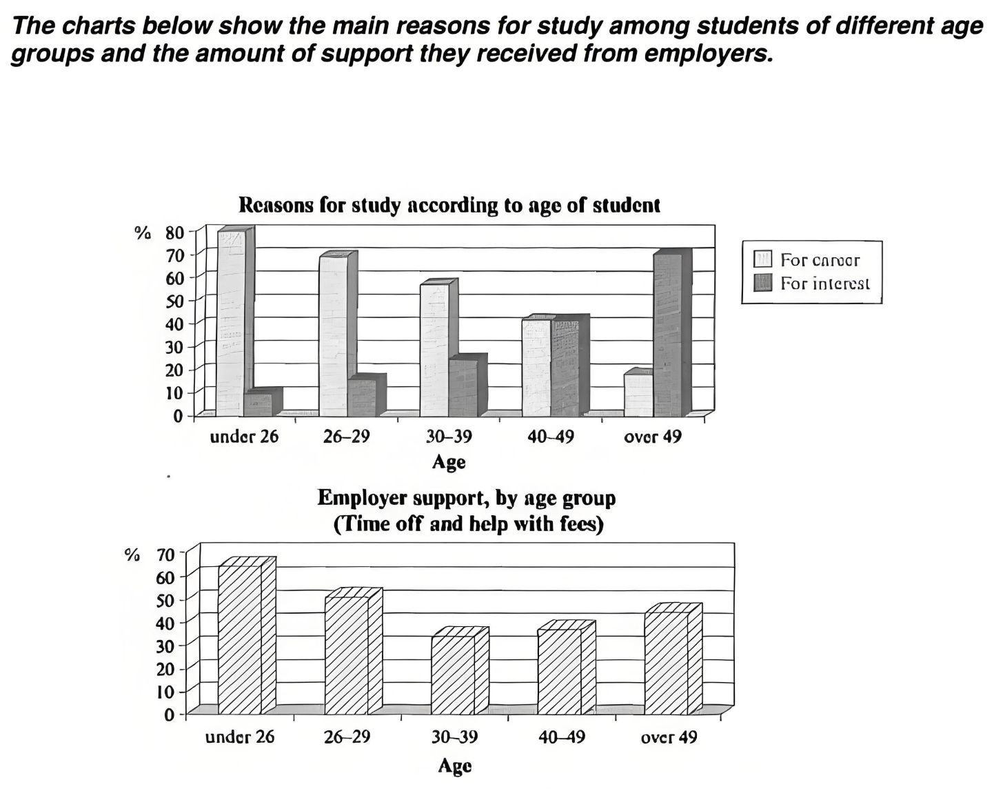
The bar charts illustrate the primary motivations behind students' decision to pursue education across different age groups and the extent of employer support they receive in terms of time off and financial assistance.
Overall, it is evident that younger students tend to study mainly for career-related reasons, whereas older students are driven more by personal interest. Additionally, employer support is generally higher among younger age groups but shows an unexpected increase in the oldest group.
Among those under the age of 26, career advancement is the dominant motivation, with approximately 80% citing this as their main reason for studying. In contrast, only about 10% in this age group study out of personal interest. A similar trend is observed among those aged 26 to 29, although the percentage studying for career purposes declines slightly to around 70%. As age increases, the proportion of students studying for interest gradually rises, while career-related motivations decline. Notably, in the 40 to 49 age bracket, both motivations are equally weighted at around 40%. Among students over 49, the trend reverses completely, with 70% studying for personal interest and fewer than 20% pursuing education for career purposes.
A similar pattern is seen in the level of employer support. Nearly 65% of students under 26 receive assistance from their employers, but this figure steadily falls to about 30% for those in their thirties. Interestingly, support increases again among older age groups, rising to 35% for the 40–49 group and peaking at 45% for those over 49.
C7T3
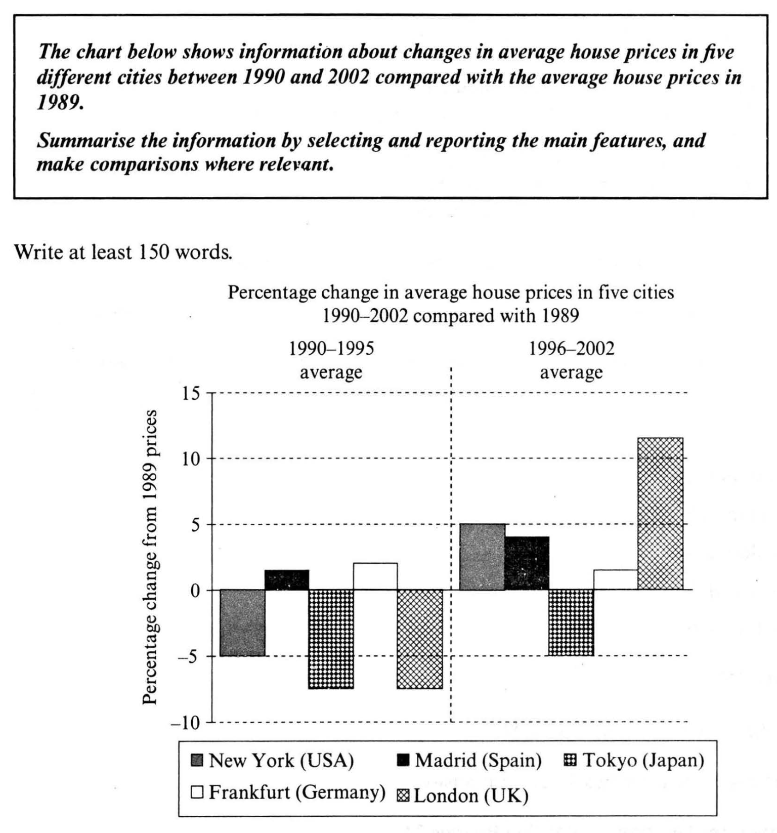
The bar chart illustrates the percentage change in average house prices in five major cities—New York, Madrid, Tokyo, Frankfurt, and London—between two periods: 1990–1995 and 1996–2002, compared to 1989 levels.
Overall, house prices in London and New York experienced significant fluctuations over the 13-year period, while Madrid and Frankfurt saw a steady and modest growth. In contrast, Tokyo was the only city where house prices consistently declined during both periods.
Between 1990 and 1995, London, Tokyo, and New York all recorded decreases in average property prices, with Tokyo experiencing the most substantial drop of approximately 7%. London and New York followed closely with declines of around 6% and 5% respectively. Meanwhile, modest increases were observed in Frankfurt (about 3%) and Madrid (approximately 1%).
In the second period (1996–2002), London saw a dramatic recovery, with house prices rising by roughly 12%, the largest surge among all cities. New York also rebounded with a 5% increase. Madrid’s housing market picked up pace, growing by around 4%, while Frankfurt’s growth slowed slightly to around 2%. Tokyo, however, continued to see a downturn, with property prices falling by a further 5%.
真题
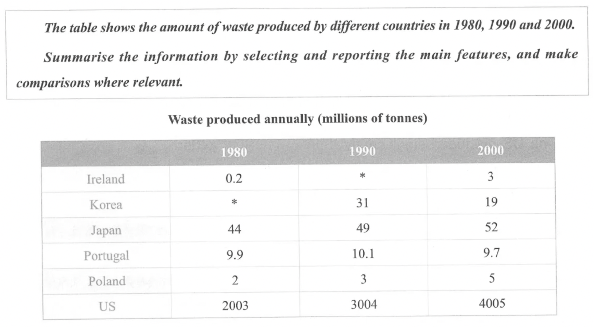
The table illustrates the amount of waste generated annually by six countries in the years 1980, 1990, and 2000.
Overall, the United States consistently produced the highest volume of waste throughout the period, with a sharp increase over time. Japan also experienced a steady rise in waste generation, whereas Korea was the only country to show a notable decline. The remaining nations produced relatively low levels of waste by comparison, with minor fluctuations.
In detail, the United States generated an overwhelming amount of waste, rising from 2,003 million tonnes in 1980 to 4,005 million tonnes by 2000, effectively doubling its output over two decades. Japan followed a similar upward trend, albeit on a much smaller scale, increasing from 44 million tonnes in 1980 to 52 million tonnes in 2000. By contrast, Korea demonstrated a significant reduction in waste production, falling from 31 million tonnes in 1990 to just 19 million tonnes in 2000. No data is provided for Korea in 1980. This downward trend contrasts sharply with the other countries.
Among the remaining nations, Portugal’s waste output remained relatively stable, with a slight decline from 10.1 million tonnes in 1990 to 9.7 million in 2000. Poland saw a modest increase from 2 million tonnes in 1980 to 5 million in 2000. Ireland, which had the lowest waste production in 1980 at only 0.2 million tonnes, increased to 3 million tonnes by 2000.
C9T3
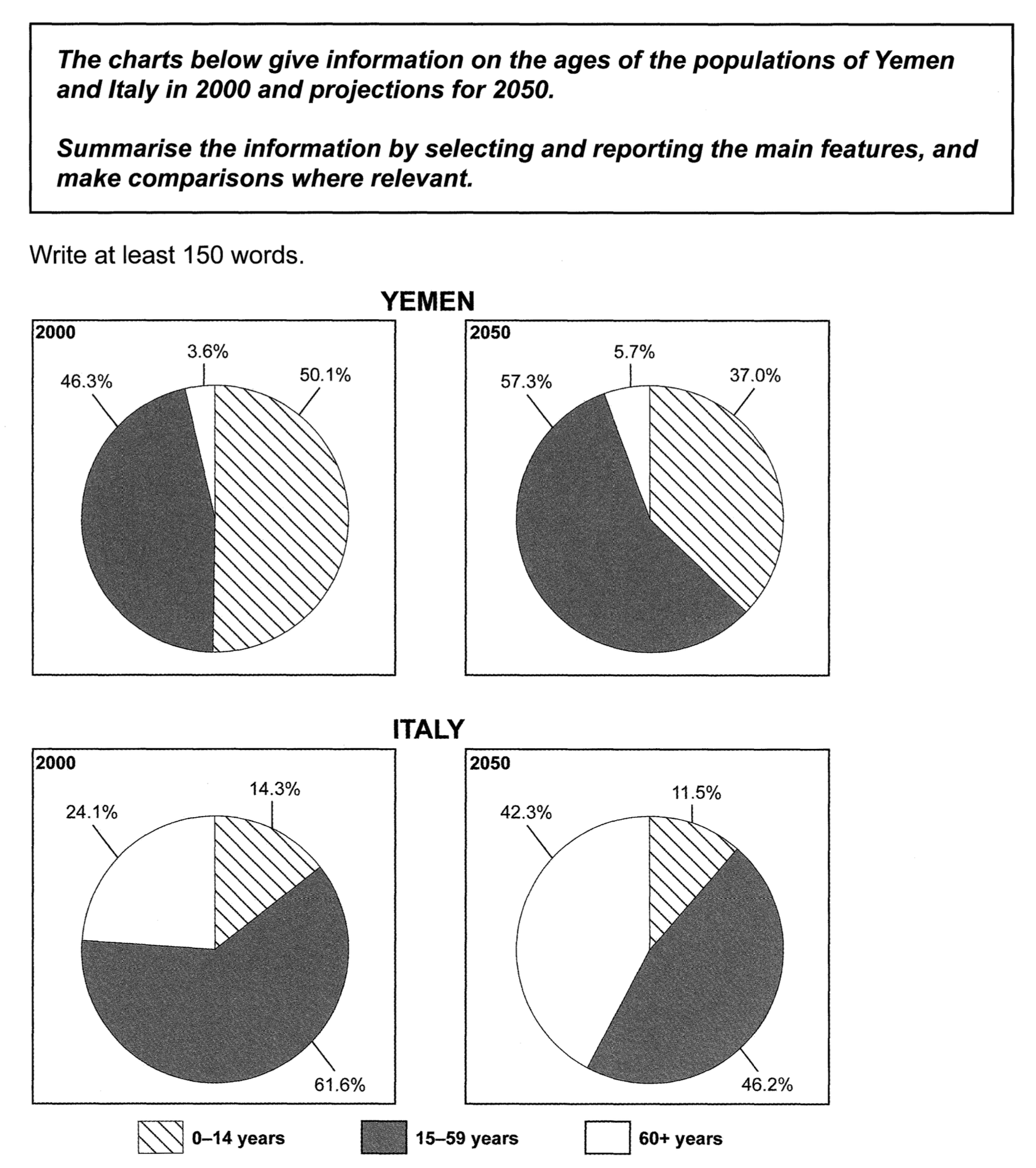
The charts illustrate the age distribution of the populations in Yemen and Italy in the year 2000, with projections for 2050.
Overall, both countries are expected to experience a demographic shift towards older populations by 2050. Italy had a significantly older population than Yemen in 2000, a trend that is predicted to continue.
In Yemen, the proportion of people aged 15 to 59 is projected to rise notably from 46.3% in 2000 to 57.3% in 2050, making it the dominant age group. Meanwhile, the percentage of children aged 0 to 14 is expected to decline from 50.1% to 37%, although this group will still form a substantial part of the population. The elderly population (aged 60 and over) is predicted to grow modestly from 3.6% to 5.7%, remaining the smallest segment.
In contrast, Italy will see a dramatic increase in its elderly population, rising from 24.1% in 2000 to 42.3% by 2050, making this age group the largest. The working-age group (15 to 59) is forecast to shrink significantly, from 61.6% to 46.2%, while the proportion of young people will also decline slightly, from 14.3% to 11.5%.
C8T4
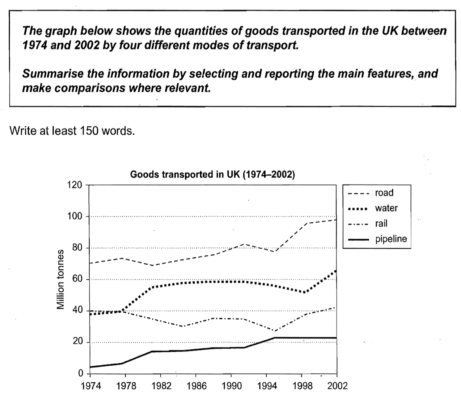
The line graph illustrates the amount of goods transported in the United Kingdom via four different modes of transport—road, water, rail, and pipeline—between 1974 and 2002.
Overall, road transport remained the dominant method throughout the period, while pipeline transport consistently accounted for the smallest share. Despite some fluctuations, most modes of transport experienced a general upward trend in the volume of goods carried.
In 1974, road transport led with approximately 70 million tonnes of goods moved, and this figure rose steadily over the years, reaching around 100 million tonnes by 2002. Water transport also showed a noticeable increase, starting at about 40 million tonnes in 1974 and peaking at just over 60 million tonnes by the end of the period, although it remained relatively stable between 1982 and 1994.
Rail transport, on the other hand, displayed a more erratic pattern. It started at roughly 40 million tonnes in 1974 but declined to a low point of around 25 million tonnes in 1994. However, it recovered slightly to end at about 40 million tonnes in 2002, similar to its starting level. Pipeline transport, although the least used, saw a steady rise from roughly 3 million tonnes in 1974 to around 21 million in 2002—a more than sevenfold increase.
地图 1
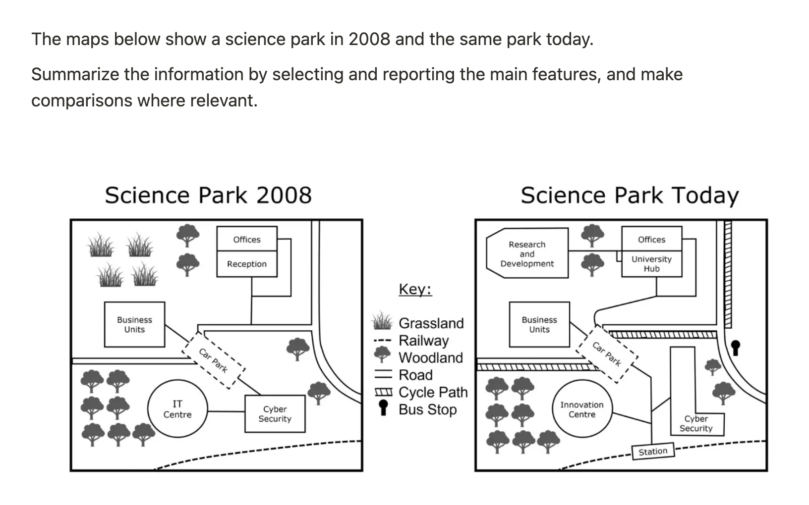
The two maps illustrate the layout of a science park in 2008 and how it has developed up to the present day.
Overall, the park has seen considerable modernization, with a focus on expanding research facilities, improving transport links, and introducing new amenities for users.
Several notable changes have occurred in the internal layout of the park. The grassland, which used to occupy the northwest corner, has been replaced by a research and development building. Meanwhile, the Cyber Security building, originally a small structure in the southeast, has been extended northward and now forms an L shape to accommodate more employees. In addition, the former IT Centre located in the southwest has been transformed into an Innovation Centre, while the reception building to the north of the car park has been replaced by a University Hub, situated adjacent to the existing office complex.
Infrastructure and access improvements are also apparent. In 2008, a railway track ran along the southern edge of the park without any connection point; however, a new station has now been built along this line, providing more convenient access to all facilities. A cycle path now encircles the park, and a bus stop has been added in the northeast corner, reflecting greater emphasis on sustainable and public transport options. Despite these modernizations, some features such as the woodland in the southwest and the car park near the business units have remained unchanged.
地图 2
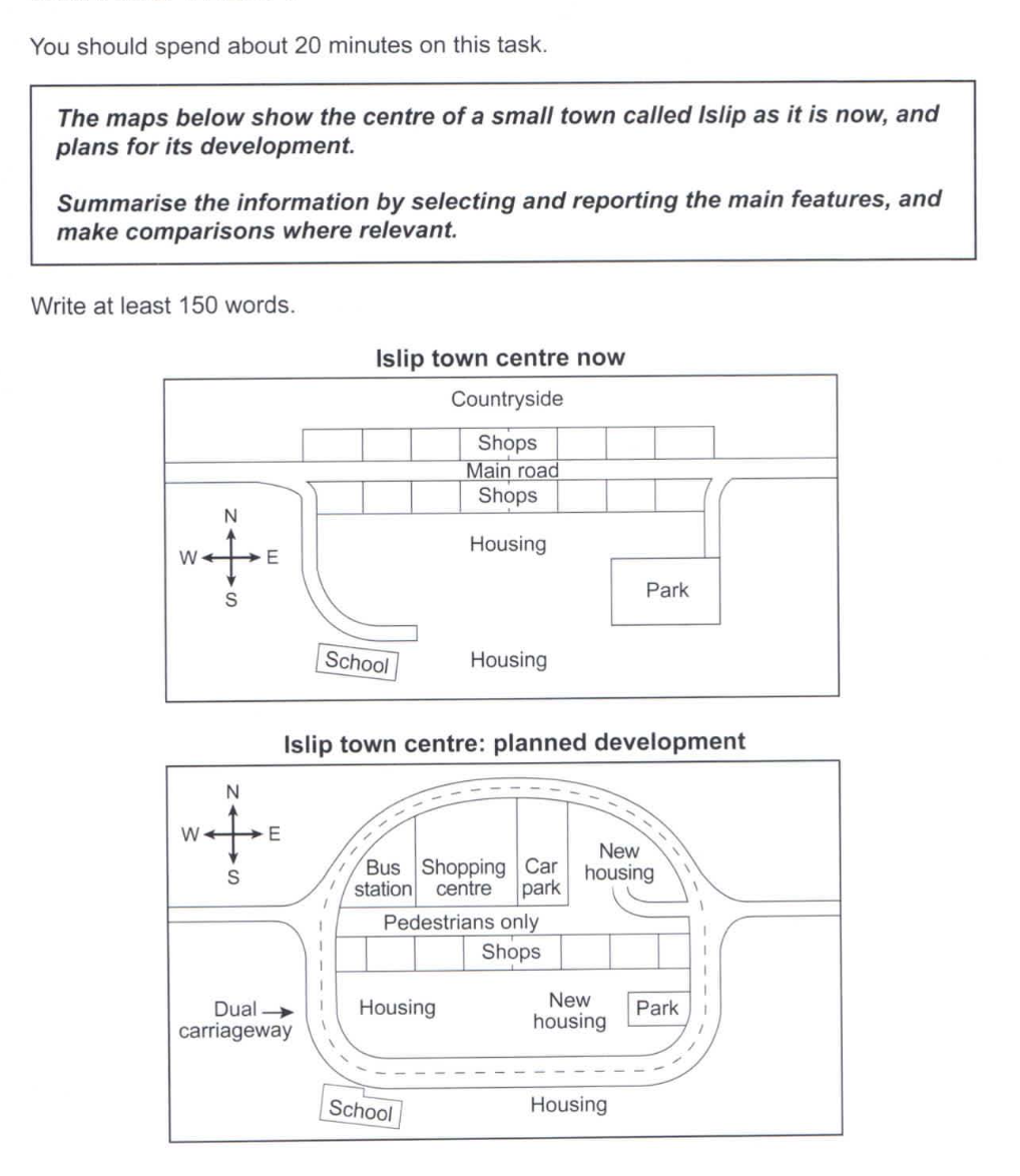
The two maps illustrate the current layout of the centre of Islip, a small town, and its proposed future development.
Overall, the town centre is set to undergo substantial transformation, with major additions to infrastructure, commercial facilities, and residential zones.
At present, Islip town centre features a main road running from east to west, which is planned to be converted into a pedestrian-only thoroughfare. In its place, a new dual carriageway will be constructed to loop around the town centre, significantly improving traffic circulation and access. Currently, the main road is flanked by two rows of shops. While the southern row will remain intact, the northern row is expected to be removed to make way for a series of public amenities, including a bus station, a shopping centre, and a car park, arranged from west to east. Additional housing will also be introduced on the northeastern side.
In the south of the main road lie existing housing areas, along with a school in the southwest and a park to the southeast, all connected by the new ring road. In the new plan, the park will be reduced in size to allow space for further residential development, though both the school and southern housing will be preserved.
流程图
The diagram below shows how geothermal energy is used to produce electricity.
Summarize the information by selecting and reporting the main features and make comparisons where relevant.
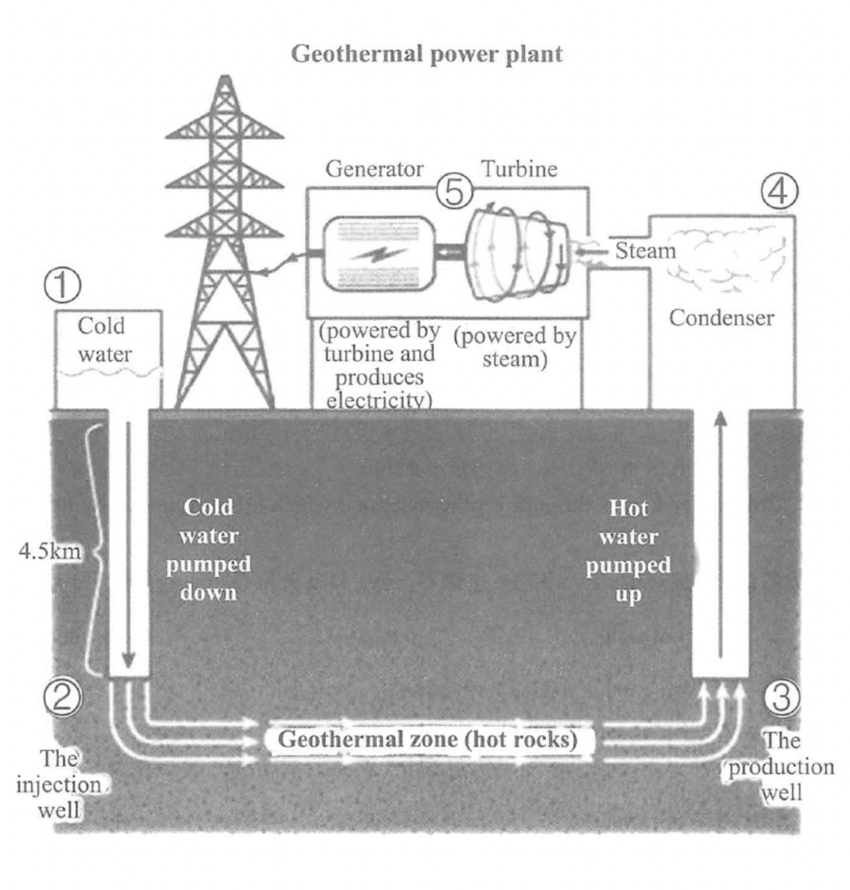
The flow chart shows the entire process of how a power plant harnesses geothermal power to generate electricity.
Overall, a geothermal power plant operates by using water as a medium to convert geothermal energy into electricity, and the whole process consists of five steps.
The plant has a tank that stores cold water. Beneath it is an injection well, pumping cold water 4.5 kilometers below the ground. In the next step, water flows horizontally through a geothermal zone, which is full of hot rocks. Here comes the next stage: the heated water reaches a production well and is subsequently pumped back to the ground.
The rest of the procedure is about how to extra power contained in hot water to create electricity. The boiling water is compressed in a condenser above the ground and condensed to create steam, which runs a turbine. It is the machine which can power a generator to create electricity---the end product of the whole procedure---and the power generated is eventually transferred to a grid.